Marble markers revolutionize nail polish application with a sleek, marker-style design that replaces traditional brushes. These easy-to-use polish markers allow for a quick, precise, and mess-free application. Designed for younger teenagers, Marble markers have a modern, unique shape. The bottle is a neutral, marble-gray tone, with a cap that matches the shade of the polish inside.

02. BRANDING
2025
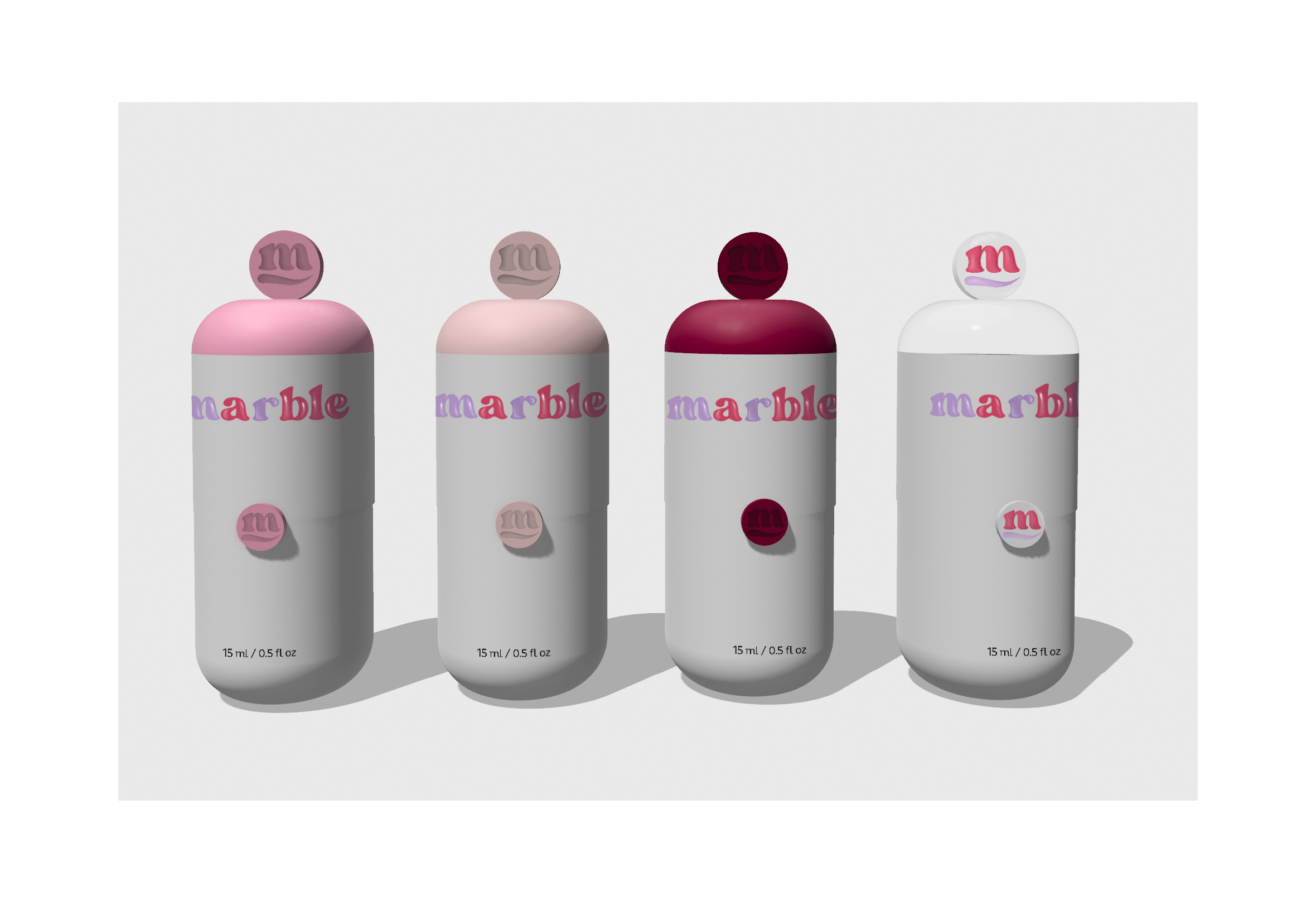

Since portability is a key advantage, Marble markers are designed with leak-free packaging. A secure button in the middle of the marker locks the cap in place, preventing spills while on the go. This same button also serves a dual function: when unlocked, it allows polish to flow into the felt-tip applicator. However, when the cap is on, this mechanism is automatically blocked, preventing accidental leaks or excess polish release.


The name marble reflects both the strength and shine of the perfect manicure. Marble markers are designed to give nails a marble-like texture, durable and glossy. At the same time, marble has a fluid, almost liquid-like appearance, mirroring how nail polish starts as a liquid before hardening into a polished surface. Marble is written in a lower case, bubbly font gives the brand a fun, approachable feel for a preteen audience. The color split (lilac for “m” and “r,” red for “able”) subtly alludes the product’s ease of use, emphasizing that with marble, anyone is able to achieve a flawless manicure. In addition, the marble submark contains a single stroke, reminiscent of the kind made by a marker.

DATA VISUALIZATION
SUMMER 2025 CAMPAIGN POSTERS


This eye tracking heat map visualizes how consumers engage visually with different parts of product packaging. Red indicates areas of high visual attention (longer or more frequent fixations), yellow reflects low attention (brief and infrequent fixations), and blue represents no significant markers of attention.
The analysis focuses on three Areas of Interest (AOIs): logo, product image, and product description
This data helps identify which packaging elements are most effective at capturing attention, guiding design improvements for maximum visual impact
Stimulus Image

COMING SOON
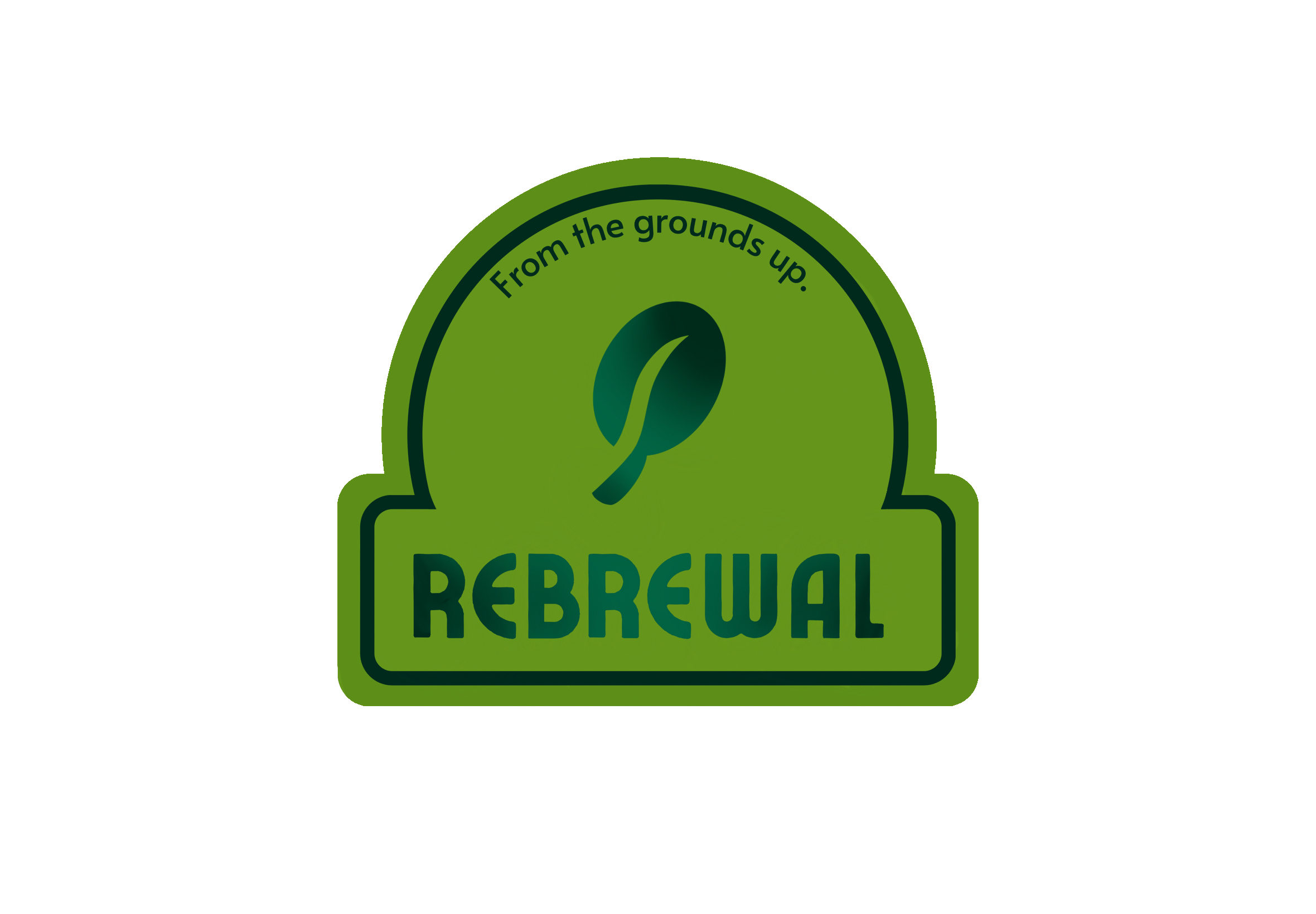
REBREWAL From the grounds up.
2024
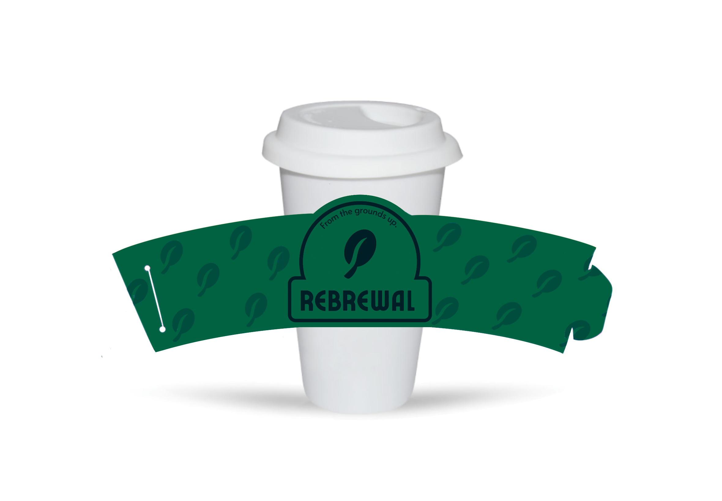
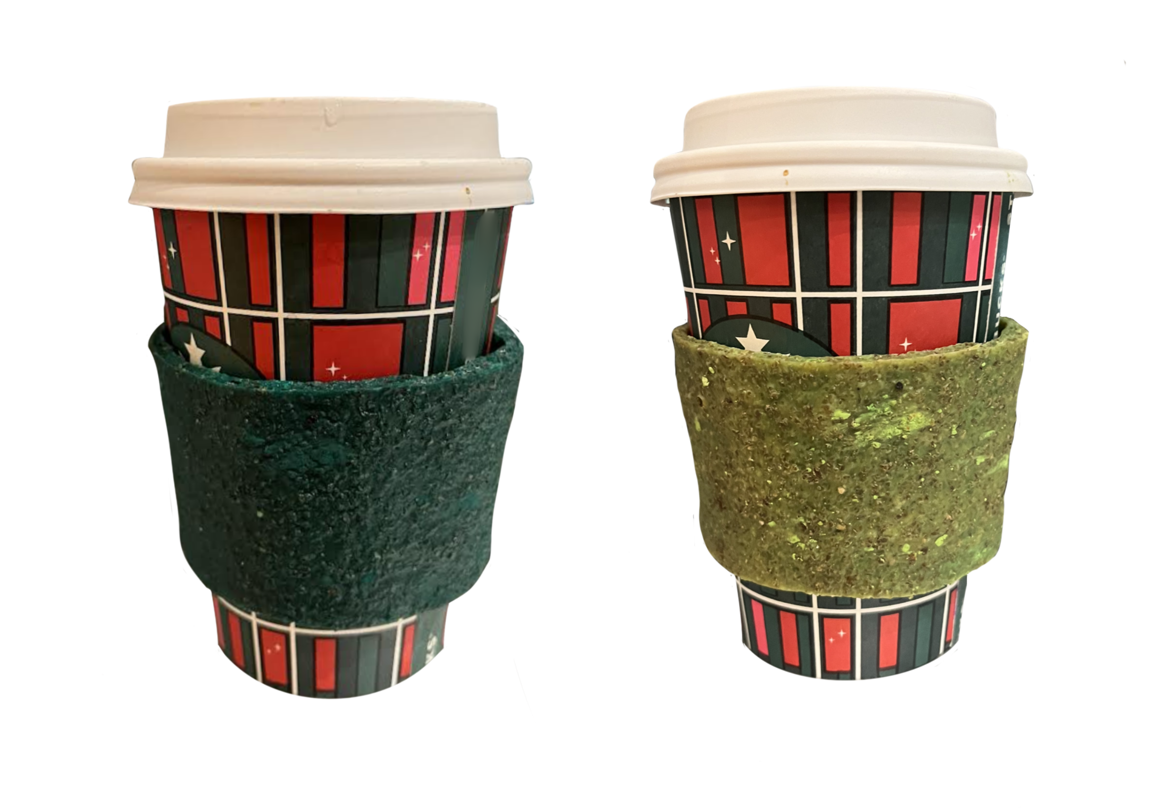
For my Biological Design course, I developed "Rebrewal," a reusable coffee cup sleeve designed to address two major forms of coffee-related waste: used coffee grounds and disposable paper products. The sleeve is made out of a coffee based bio-leather with a thermochromic pigment. It shifts from dark teal when cold to a lime green when warmed, offering a unique, interactive element that appeals to consumers beyond its environmental benefits.
Primary Logo

Advertisement designed in Adobe InDesign. Image was generated by ChatGPT.
Cup sleeve at cool temperature.
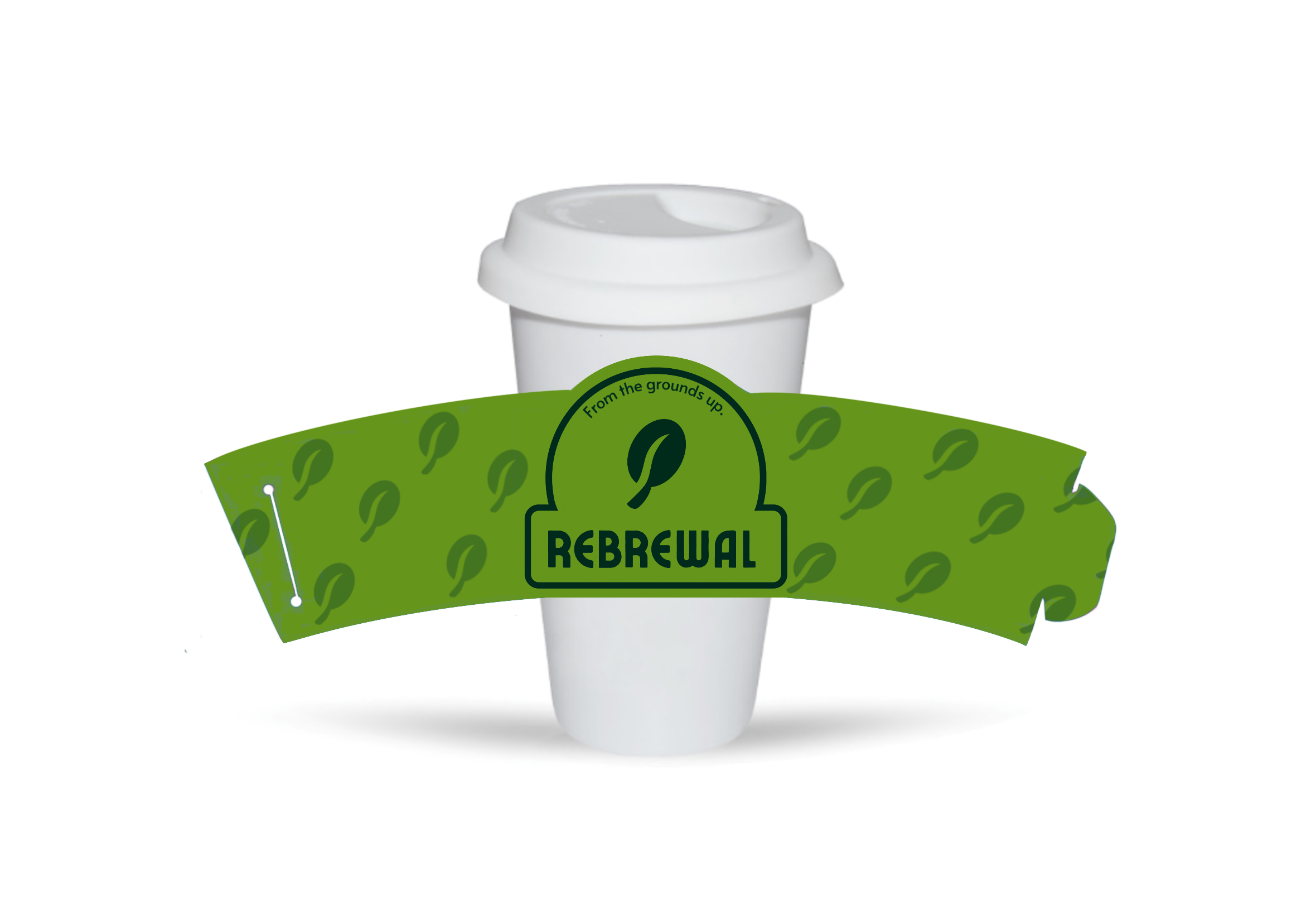
Cup sleeve at warm temperature.

The tagline, "From the grounds up," captures the essence of the Rebrewal brand by referencing both the upcycled coffee grounds used in the product and the broader themes of growth and renewal. The overall green color scheme reinforces the product’s eco-friendly nature, making it instantly recognizable as a sustainable choice for coffee drinkers.

Rebrewal Branding Mockup
Thermochromic pigment makes the cup sleeve change color as the drink cools.
The branding for Rebrewal reflects its core values of upcycling, renewal, and transformation. The logo is central to this identity, featuring a coffee bean merged onto a leaf at its center while hinting at a sunrise with its overall shape. The sunrise and coffee-leaf symbolize the renewal and transformation process inherent in this product’s life cycle, turning waste into something valuable. The color gradient used in the icon and text further emphasizes the dynamic nature of the sleeve, alluding to its temperature-sensitive, color-changing technology.

Rebrewal Branding Guide
I created a prototype of the Rebrewal Coffee Cup Sleeve by combining oil, water, sodium alginate, glycerine, thermochromic pigment, and used coffee grounds. After allowing the mixture to dry, I cut the newly formed bio-leather into the shape of a coffee cup sleeve. The result was a fully functioning product that demonstrated the concept of upcycling coffee waste into a practical and sustainable item.
Coffee Cup Sleeve Prototype
Bows by Elisa
2024

Bows by Elisa Branding Mockup

Bows by Elisa Medium Gift Box Mockup

Bows by Elisa is a small business specializing in handcrafted hair bows for children. The client sought a brand identity that would capture the delicate and charming nature of their products, while appealing to parents looking for high quality hair accessories for their children.
The centerpiece of the Bows by Elisa brand is its unique logo—a ribbon shaped into a bow, with the sides forming the letters "E" and "B." This design not only represents the product but also incorporates the brand’s initials. The logo's flowing lines mirror hair bows themselves, creating an immediate connection between the brand and its products.
The packaging design was developed to accommodate various product sizes, with both medium and small boxes included in the mockups. Each box is adorned with the brand’s colors and logo, ensuring a consistent and polished look across all packaging. Additionally, I designed a display card in the shape of the brand’s logo, offering a charming presentation for the bows in retail environments and adding to the overall brand experience.
Bows by Elisa Display Card Mockup

Bows by Elisa Branding Guide
Favicon