Glossier: The Design Decisions that Keep You Shopping In-Store
In under ten minutes, you can place an order for Glossier’s Cloud Paint and have it delivered to your doorstep. The same is true of almost any product with an online presence. Yet brick and mortar stores continue to offer something a website cannot: the ability to transform shopping into an immersive experience.
Glossier’s pastel-pink façade immediately stands out among the surrounding stores on Walnut Street. Its color creates visual salience, making the storefront more likely to capture the attention of passersby. For someone without a planned purchase, this distinctive cue can act as a behavioral trigger, prompting an impulsive visit motivated by curiosity, entertainment, or a social experience.
This is where Glossier’s retail strategy differs from purely frictionless shopping. The store is not designed simply to help customers find a product and leave. It is designed to make spending time there feel enjoyable.
Inside the Glossier Store
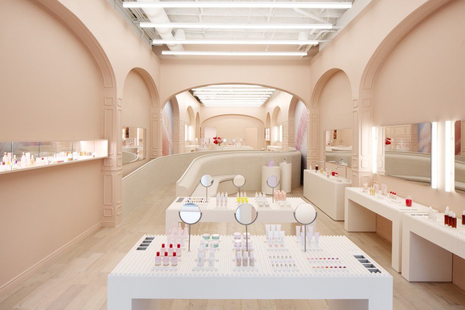
The store’s minimalist layout supports processing fluency, or the ease with which people interpret information. Inside, products are displayed at waist height alongside strategically placed mirrors, making it easy to reach for, test, and compare them. Customers can also use Glossier bath products to remove testers, adding another opportunity for experimentation. Together, these details shift visitors into discovery mode, even if they entered with a specific purchase in mind.
Generous white space and clearly separated displays guide the eye across categories without making the assortment feel overwhelming. This simplicity also acts as a premium cue, giving the space the calm, curated atmosphere associated with luxury retail.
Glossier’s price presentation reinforces that perception. Whole-number prices appear in a small sans-serif typeface, maintaining the store’s clean visual language. During my visit, associates also offered a free product with purchases over $60. The limited offer introduced urgency and encouraged more impulsive decision making without relying on bold discount graphics that might weaken the brand’s premium positioning.
Glossier uses the Gestalt principles of similarity and proximity to organize its assortment. Products from the same line share nearly identical packaging and are displayed together, allowing shoppers to recognize them as a group. Each display contains individual shades that require closer inspection to distinguish. The arrangement therefore feels orderly from a distance but rewards engagement up close. Customers can understand the category quickly, then move in to test colors and compare options.
Proximity also influences which products seem to belong together. Lip products sit near other lip products, while face products are grouped with complementary face products. Some displays combine items from different categories, subtly framing them as a set. This form of visual bundling can encourage shoppers to imagine a complete routine rather than evaluate each product in isolation.
The Purchase Experience
At the moment of purchase, Glossier replaces the traditional checkout line with roaming associates who process transactions directly. This preserves the open flow of the space and prevents the experience from ending in a visibly transactional queue.
After paying, customers collect their purchases from a pick-up area at the back of the store, requiring customers to explore all areas of the store, while allowing inventory to remain hidden and the sales floor to stay visually minimal. Each order arrives in a Glossier bag labeled with the customer’s name—a small act of personalization that strengthens the connection between shopper and brand.
The back of the store also features branded merchandise and a selfie mirror. These elements extend the experience beyond the purchase itself, giving customers an opportunity to create and share content. The store becomes not only a place to buy Glossier but also a setting in which customers can publicly participate in its identity.
I entered Glossier that day intending to take a quick look and left with three new products. That outcome was not the result of one dramatic sales tactic. It emerged from a sequence of carefully designed cues: a salient storefront invited me inside, accessible displays encouraged experimentation, visual organization supported discovery, and a streamlined checkout made purchasing feel effortless.
Glossier demonstrates that physical retail is not disappearing so much as changing roles. When convenience is available online, stores must offer something richer: interaction, discovery, personalization, and a sense of belonging. Consumer psychology sits at the center of that shift, shaping environments people do not simply shop in, but actively want to experience.