The Psychology Behind YibYo’s Packaging
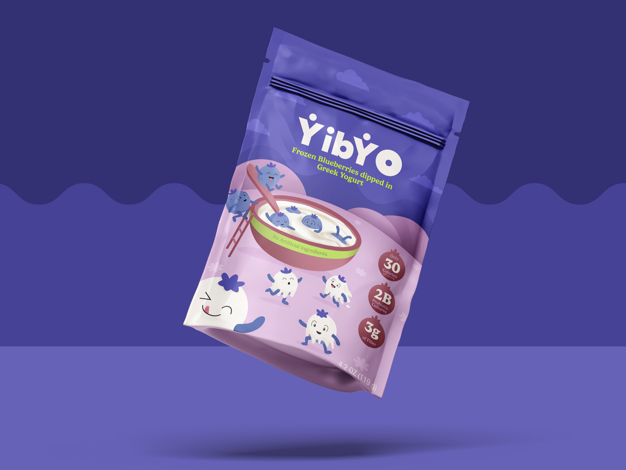
YibYo is a snack brand built around a simple but unconventional product: frozen blueberries dipped in Greek yogurt. My goal was to create a visual identity that made the product instantly understandable while making a nutritious snack feel genuinely exciting.
The concept was inspired by better-for-you brands such as Tru Fru and Fruit Riot, which challenge the visual conventions of health food. Rather than relying on muted earth tones, nature photography, or clinical wellness language, they borrow from the world of candy, using saturated colors, playful typography, and high-energy visuals. Nutritional claims then reveal their healthier positioning.
That tension became the starting point for YibYo. I wanted to combine the playfulness, personality, and convenience of a bite-size treat with the freshness and nutritional value of a breakfast bowl.
Designing for the order in which people see
The packaging was designed around four stages of consumer interaction: capturing attention in a crowded freezer, explaining an unfamiliar product, stimulating appetite, and communicating a deeper brand promise, that healthy eating can feel abundant, joyful, and fun.
Consumers scan, interpret, and evaluate packaging within seconds. Therefore, each design decision had to move the viewer from curiosity to comprehension and, ideally, to desire.
Attention
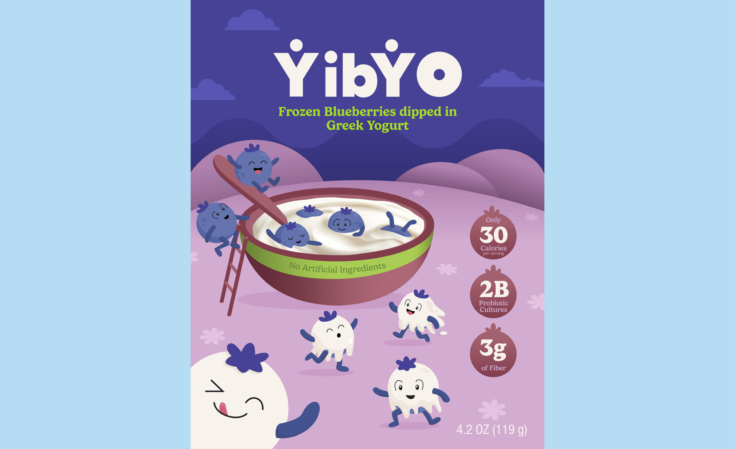
To give YibYo a distinctive visual hook, I created a cast of energetic blueberry characters nicknamed “yibs.” Although the ingredients are simple (fruit and yogurt) these characters transform them into a playful brand world. On the package, the yibs laugh, climb, swim, and dive into a pool of Greek yogurt.
This scene uses schema incongruity. Consumers already have mental models, or schemas, for how blueberries and yogurt are usually presented. Turning a yogurt bowl into a swimming pool introduces an unexpected element that interrupts habitual scanning and encourages a second look.
The characters also use anthropomorphism to create emotional engagement. Faces naturally attract attention, while the "yibs” gestures and actions personify the brand further. Instead of simply showing ingredients, the packaging gives consumers a miniature story to enter.
In addition, the indigo background creates a bold color block that can stand out against photographic imagery commonly found in frozen-food packaging. The color block serves as a distinctive brand asset that allows consumers to group the different Yibyo products through similarity, making the brand easier to locate and recognize on the shelf.
Fluency and Product Understanding
Once the packaging attracts attention, the product must be understood almost immediately. This is especially important for YibYo because it introduces an unfamiliar snack format. A photograph of a white-coated bite might show its what it looks like without explaining what it is.
To solve this, I used illustration to visualize the product’s transformation. The uncovered blueberries enter the bowl, while yogurt-covered blueberries emerge from it, providing a visual explanation of how YibYo is made. This supports processing fluency, or the ease with which people can understand and interpret information. Products that are easier to mentally process often feel more familiar, trustworthy, and approachable. By turning the preparation process into a simple visual narrative, the package reduces the cognitive effort required to understand a new product.
The written product descriptor reinforces that clarity. “Frozen blueberries dipped in Greek yogurt” appears immediately beneath the logo in bright lime green, contrasting with the indigo background. This establishes a deliberate text hierarchy: brand name first, product explanation second, and supporting nutritional information afterward. For a familiar product category, the descriptor might be less prominent. For YibYo, however, comprehension is part of the value proposition. If the shopper does not immediately understand the format, the packaging has already created friction. The hierarchy was designed to answer the most important question “What is this?” before asking the consumer to consider anything else.
Sensory cues
The next challenge was making YibYo look like something people would genuinely want to eat. Frozen fruit bites are irregular, and yogurt coatings can melt, crack, or just look messy. For that reason, I chose not to rely on a transparent window or conventional product photography. Instead, illustration allowed me to present the product in a more imaginative and controlled way.
However, a completely illustrated package risked losing the sensory richness associated with food. To balance fantasy with appetite appeal, I used a photorealistic yogurt texture inside the illustrated bowl. This contrast makes the yogurt the sensory focal point of the scene. Its visible swirls, thickness, and softness suggest creaminess and freshness, encouraging sensory imagery so that the viewer can begin to imagine the product’s texture and temperature before tasting it.
Brand Values and Persuasion
No amount of sensory cues can make blueberries and Greek yogurt compete with a tub of cookie dough ice cream on decadence alone. YibYo needed a different emotional promise.
Its value lies in offering a sweet snack that feels both enjoyable and nutritionally worthwhile. Rather than presenting health as a compromise (or YibYo as the responsible substitute someone reluctantly chooses) the brand positions healthy snacking as generous, social, and pleasurable.
The abundance of "yibs" helps communicate that idea. Instead of presenting one precious, perfectly styled bite, the design shows a lively crowd occupying the scene. This creates a sense of plentifulness and makes the product feel less restrictive. Nutritional claims are introduced as reassurance rather than as the brand’s entire personality. They substantiate the product’s functional value without overpowering its playful identity.
This balance responds to a common consumer goal conflict: wanting the pleasure of a sweet snack while also seeking nutritional value. The playful imagery builds emotional appeal, while the nutritional cues substantiate the product’s functional benefits. Together, they position Yibyo as a snack in which enjoyment and health are not competing ideas, but equally important parts of the experience.
As the healthy-snack category grows, consumers are no longer looking only for products that meet nutritional goals. They also expect those products to deliver personality, pleasure, and emotional reward, creating an opportunity for brands to move beyond the visual language of restriction.
YibYo was designed around that shift. Its packaging uses surprise to earn attention, processing fluency to explain an unfamiliar format, sensory imagery to stimulate appetite, and playful abundance to make nutrition feel less like a sacrifice. The result is a brand that does not ask consumers to choose between “healthy” and “fun.” It makes the case that the most compelling modern snacks can and should be both.