Sasa: sabor y salud
Sasa Rebrand
PACKAGING DESIGN
LOGO DESIGN
BRAND DESIGN
MARKETING MATERIALS
ILLUSTRATION

With more than 40 years in the market, SaSa is Nicaragua’s leading brand of ground cereals. The rebrand repositioned SaSa with a fresher, healthier, and more premium identity while preserving the familiarity it had built across generations. My work encompassed a renewed brand identity, redesigned packaging for the core cereal line, and the creation of a new children’s product line.
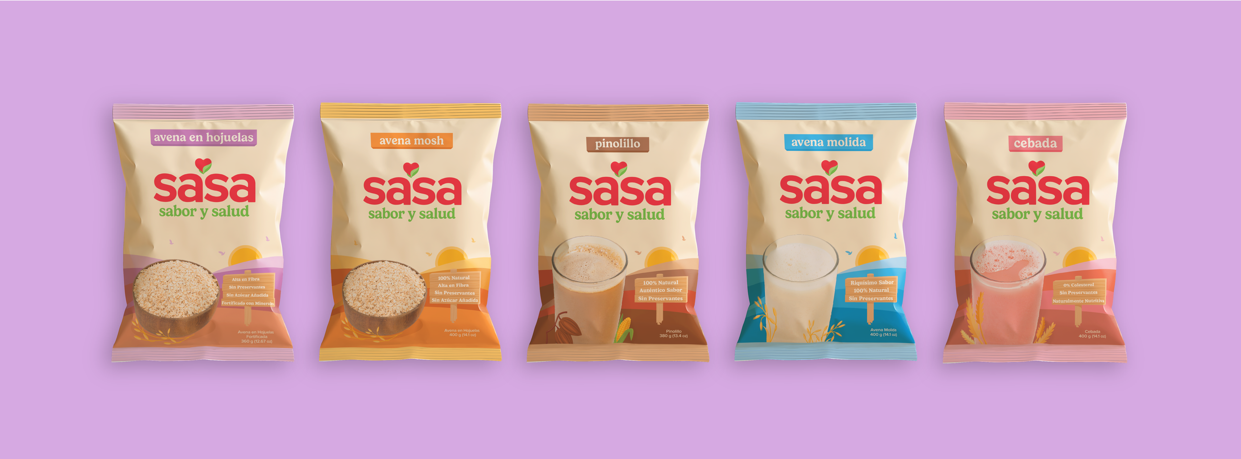
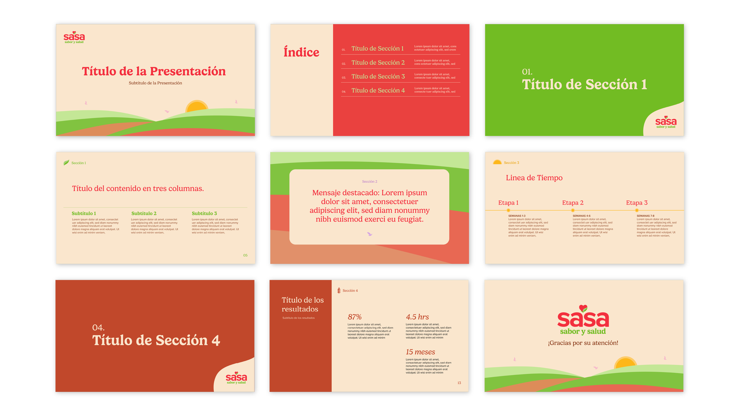
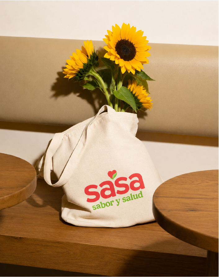
Balancing category trends with Nicaraguan tradition
The goal was to redesign Sasa’s brand identity to emphasize health and natural ingredients through a cleaner, more contemporary visual system, including an updated logo, color palette, typography system, and fully redesigned packaging. A main challenge was aligning Sasa’s visual identity with newer category trends while still preserving the familiarity and recognition the brand had already established.
I redesigned Sasa’s logo to feel warmer, symmetrical, and visually harmonious, translating its promise of “sabor y salud”—“flavor and health”—into a distinctive heart-and-leaf symbol.
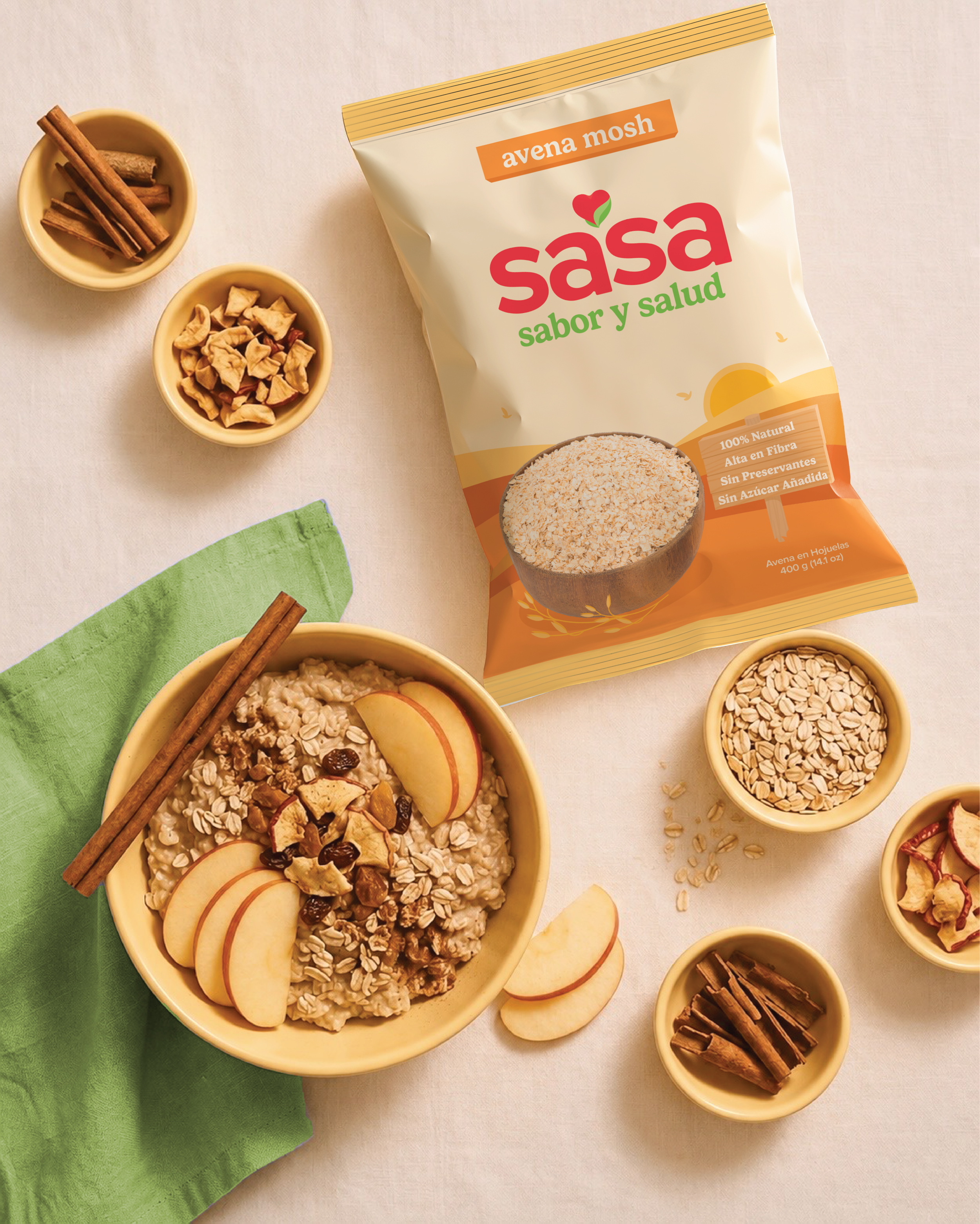
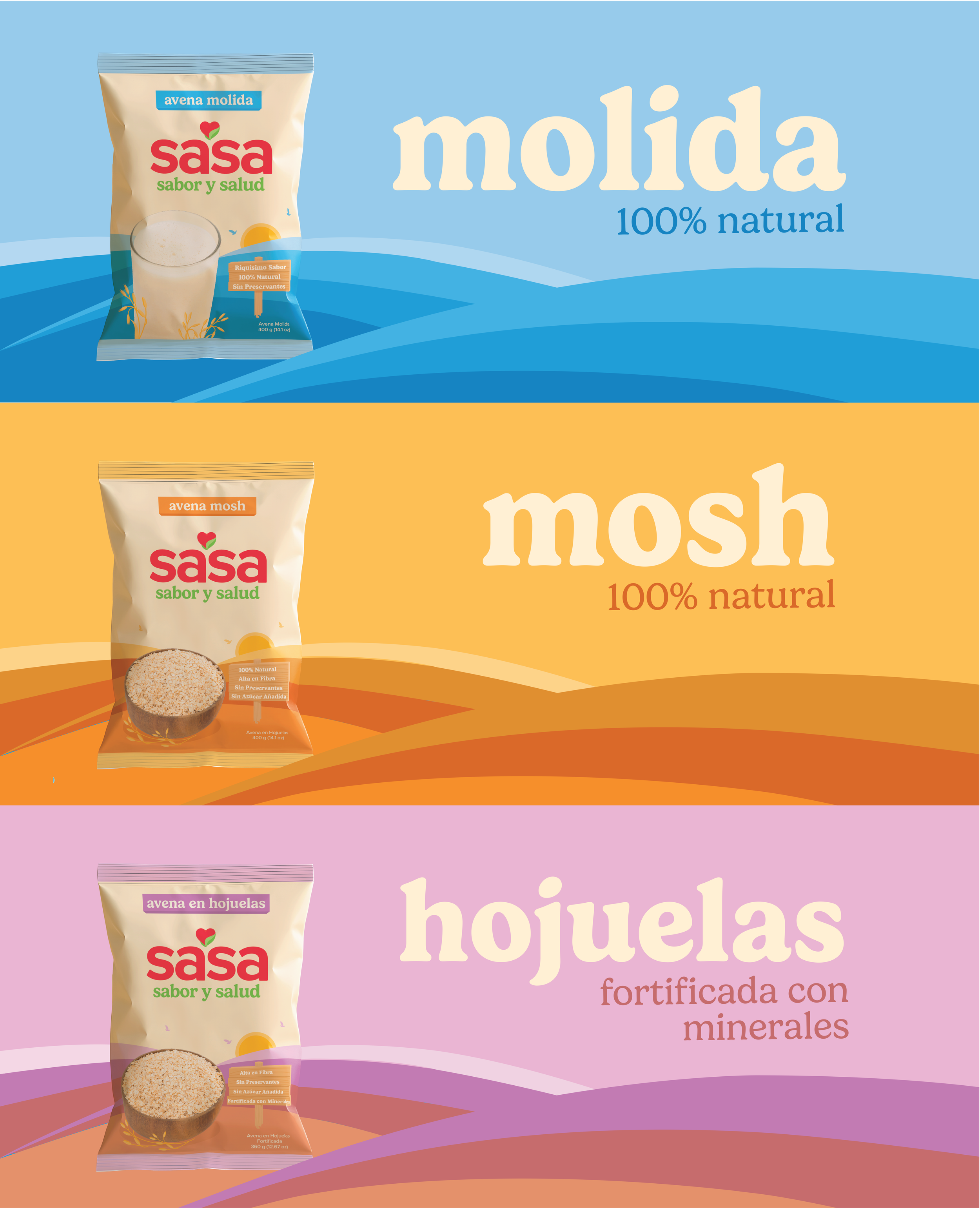
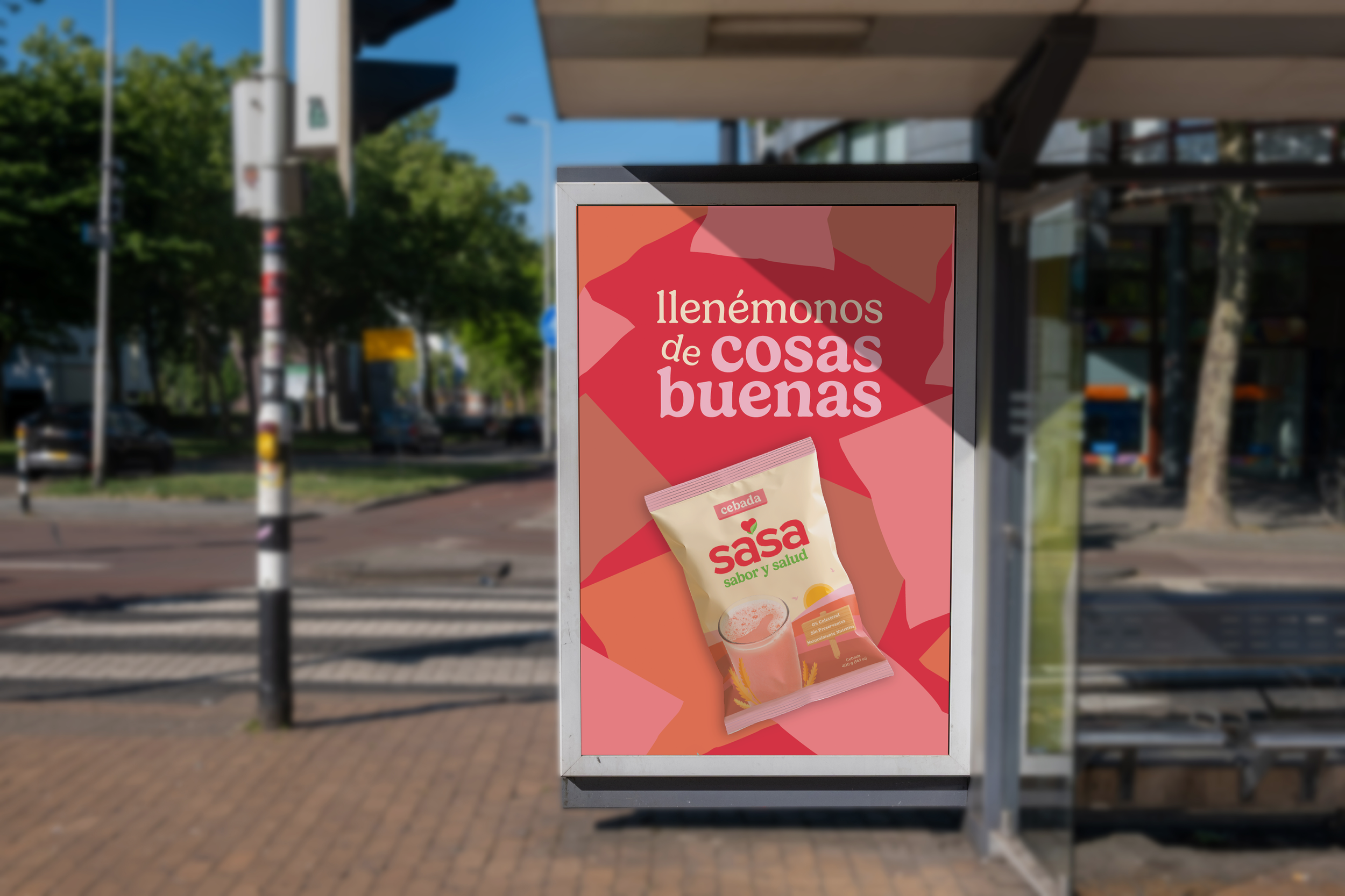
For Sasa's core product line, I focused on communicating the natural quality of their products by introducing softer, more intentional illustrations, highlighting product benefits, and removing repetitive product photography.
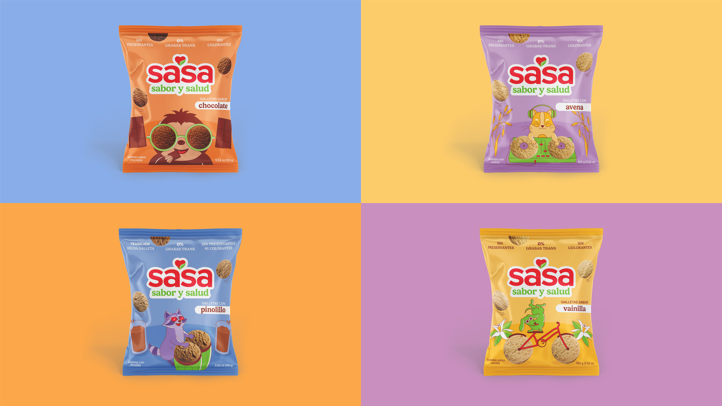
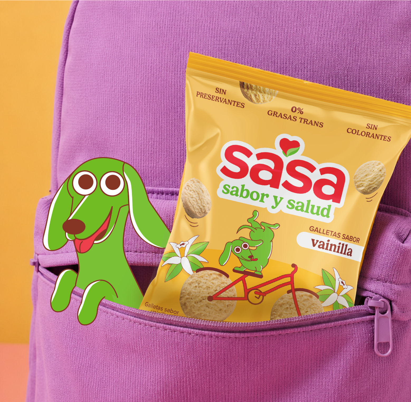
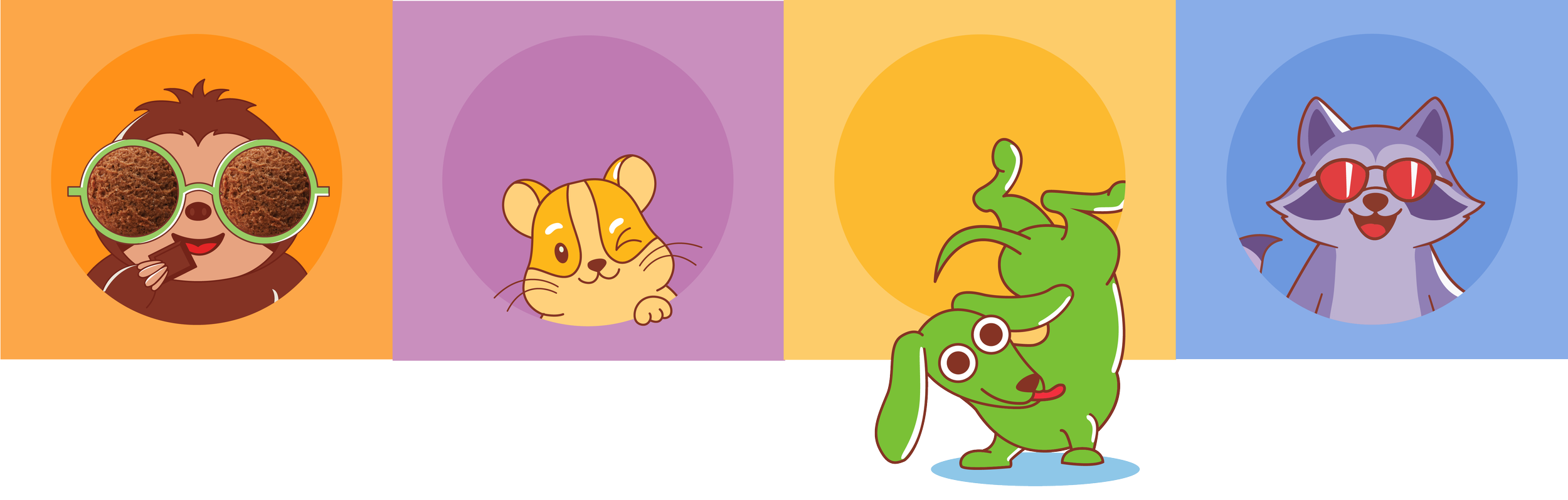
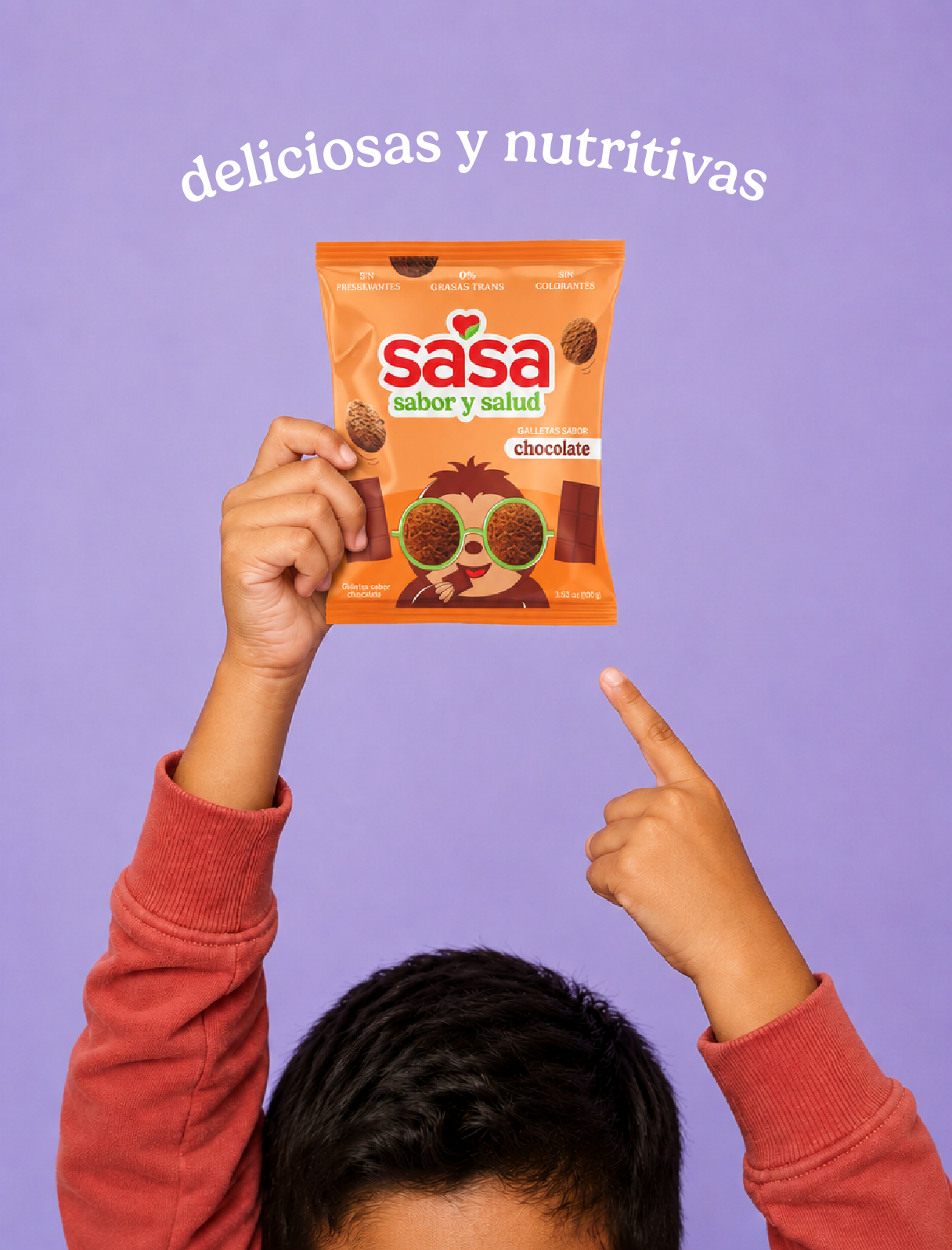
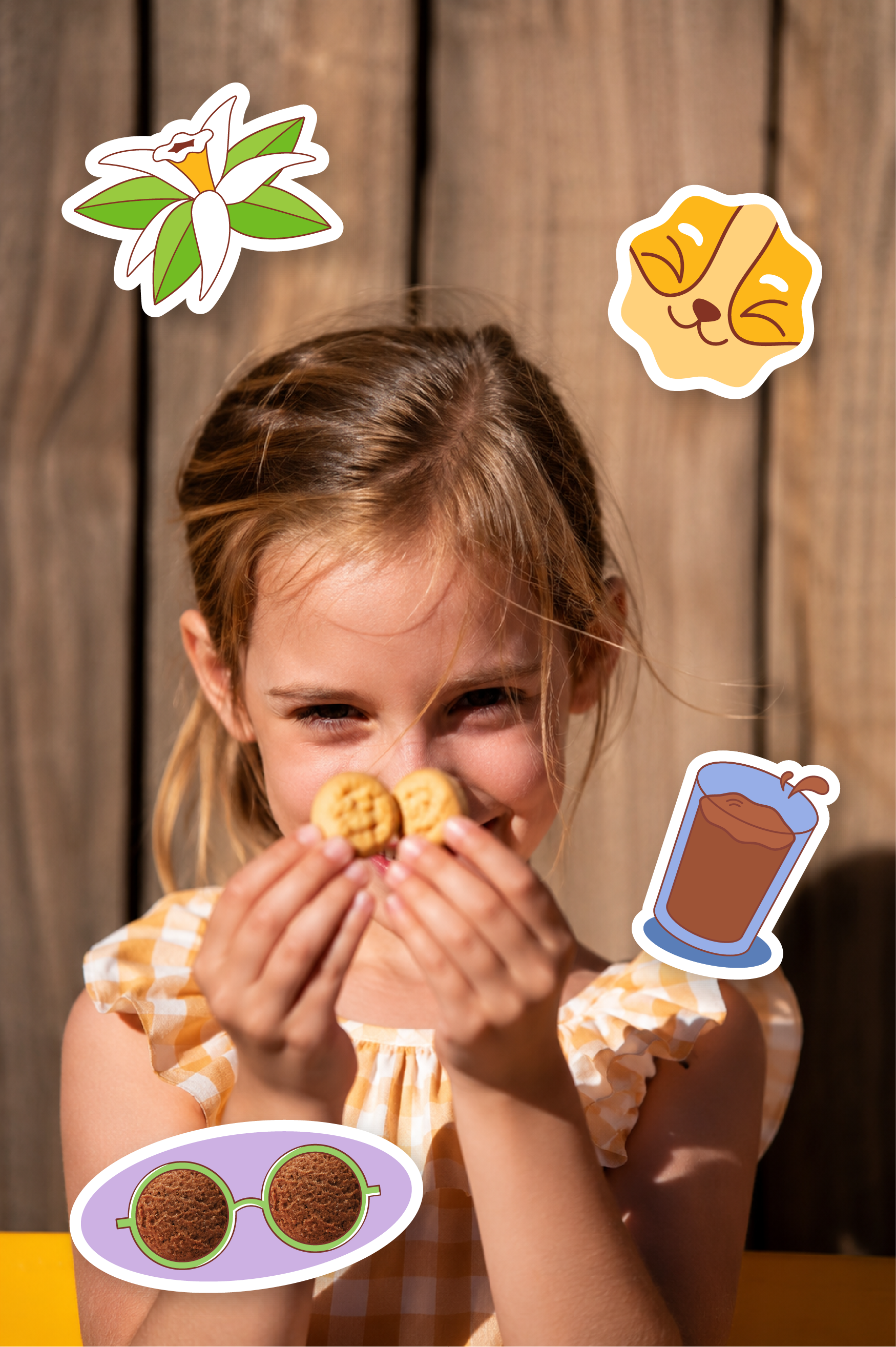
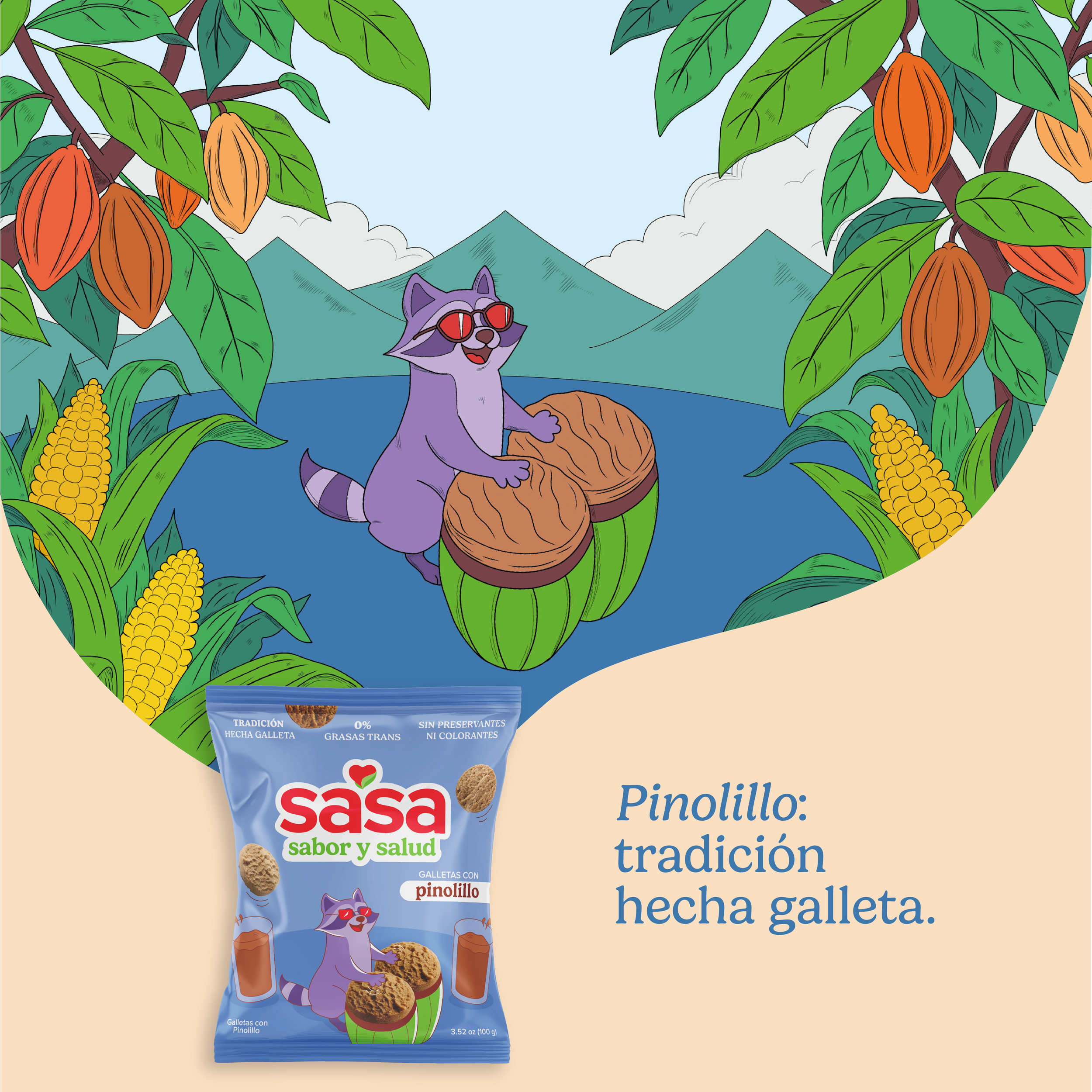
I also developed the packaging for a new cookie line aimed at children ages 6–12, balancing a playful personality with SaSa’s established health-focused positioning. I illustrated a unique character for each flavor, creating a cohesive product family that appeals to both children and parents.
Sasa Galletas